

Wednesday, December 30, 2009
"The Interuped Drink" completed
Just in time to sign it with the years 2009 I am happy to finish Raja's piece and very pleased with how it came out. It has a subtle dark green background that is quite difficult to see in this photo. I am going to wait to put a zoomify image on my web site until I get a scan or better photo of the work that shows the background more correctly. The values and colors on the cat are about correct. Thanks for following along... and on to the next piece and a new year!!

Thursday, December 24, 2009
Happy Holidays!
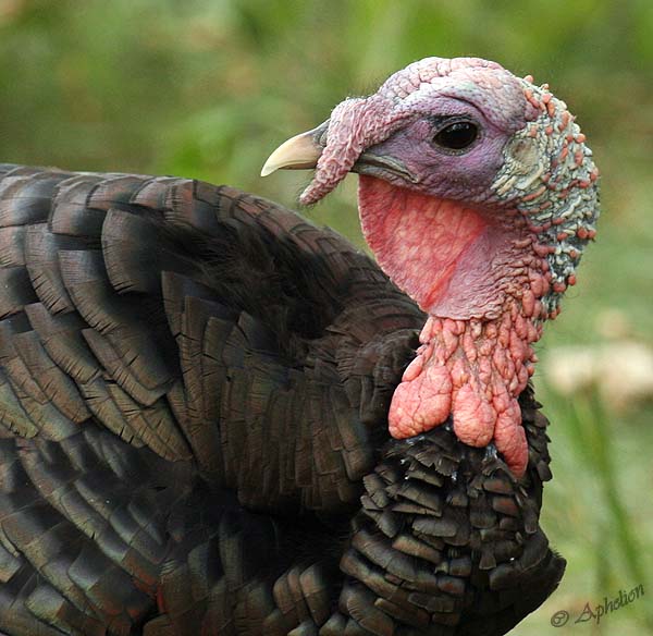
Wishing everyone a safe and happy holiday!

(OK, so not really a holiday photo, but its cute anyways!)
I am off to go see my family- will be back early next week.

(OK, so not really a holiday photo, but its cute anyways!)
I am off to go see my family- will be back early next week.
Sunday, December 20, 2009
A bit on Correcting Mistakes (in Scratchboard)
Since I got two e-mails today asking the same thing I thought I would spend a brief bit of time to cover what to do if you make a minor mistake in scratchboard.
Many people believe (and many scratchboard artists like to propagate the myth) that once you put a scratch into the board that you can not do anything to get rid of it. This is not really true. Scratchboard is, by nature, white clay covered with black ink. When doing scratch art we are scratching away the black ink. So if we make a mistake... what do we do? Well put the ink back of course!
Now this isn't quite as simple as it sounds on the surface, as every type of black ink has a slightly different shade or color cast to it. Some have a slight blue or brown cast, some look too shiny or too dark, so it is important to find an ink that matches the boards you are working on (try it on a test board before putting it on your art!). It is also important that it be as archival as our boards and won't change colors over the years. Since I work on ampersand boards they are kind enough to sell small bottles of black repair ink (which you can get directly from them or in with the color ink kits). When trying to totally eliminate a line or area you can put the ink on full strength with a paintbrush. If you want to just tone a line down you can mix the ink with water to create ink washes. Sometimes the black ink will look a bit too dark and shiny straight out of the bottle, but once the whole board is sprayed with a fixative it blends in. Also if you blot it with your finger when it is almost dry tends to take off the shine.
On a side note, to be able to remove a line or area so that no one will know that a scratch was ever there you must scratch with light pressure and not have gouged into the clay. If you are pushing hard and pulling up clay as well as the black ink then you will be able to see a minor impression even after you re-ink the area. If you are not sure if you are scratching both clay and ink look at what is coming off your board. If the scrapings are all black, that is ink. If you see white particulates mixed in there, that is clay. You can also do the touch test by lightly running your hand over different areas of the board. You will not really feel any texture in scratched areas if all you are scratching is the ink, but much more of an impression if you have scratched into the clay.
So while a good line drawing and feeling for where you are going with a board is very important, don't be afraid of making minor mistakes. They can be fixed! Its not quite as simple as a pencil eraser, but no need to trash that board just because of a few lines that are not as you intended.
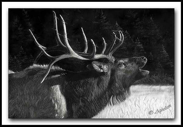
Below is a small example of a 'fix' with ink from my large elk piece "The Challenger". The top image was an area above the back that I was going to origianlly have steam coming off his back. Well due to a variety of issues and problems with getting the steam to look the way I wanted I changed my mind and decided to go for a more subtle tree background. You can't tell at all, even on the real board, that the steam was ever there.


Many people believe (and many scratchboard artists like to propagate the myth) that once you put a scratch into the board that you can not do anything to get rid of it. This is not really true. Scratchboard is, by nature, white clay covered with black ink. When doing scratch art we are scratching away the black ink. So if we make a mistake... what do we do? Well put the ink back of course!
Now this isn't quite as simple as it sounds on the surface, as every type of black ink has a slightly different shade or color cast to it. Some have a slight blue or brown cast, some look too shiny or too dark, so it is important to find an ink that matches the boards you are working on (try it on a test board before putting it on your art!). It is also important that it be as archival as our boards and won't change colors over the years. Since I work on ampersand boards they are kind enough to sell small bottles of black repair ink (which you can get directly from them or in with the color ink kits). When trying to totally eliminate a line or area you can put the ink on full strength with a paintbrush. If you want to just tone a line down you can mix the ink with water to create ink washes. Sometimes the black ink will look a bit too dark and shiny straight out of the bottle, but once the whole board is sprayed with a fixative it blends in. Also if you blot it with your finger when it is almost dry tends to take off the shine.
On a side note, to be able to remove a line or area so that no one will know that a scratch was ever there you must scratch with light pressure and not have gouged into the clay. If you are pushing hard and pulling up clay as well as the black ink then you will be able to see a minor impression even after you re-ink the area. If you are not sure if you are scratching both clay and ink look at what is coming off your board. If the scrapings are all black, that is ink. If you see white particulates mixed in there, that is clay. You can also do the touch test by lightly running your hand over different areas of the board. You will not really feel any texture in scratched areas if all you are scratching is the ink, but much more of an impression if you have scratched into the clay.
So while a good line drawing and feeling for where you are going with a board is very important, don't be afraid of making minor mistakes. They can be fixed! Its not quite as simple as a pencil eraser, but no need to trash that board just because of a few lines that are not as you intended.
Below is a small example of a 'fix' with ink from my large elk piece "The Challenger". The top image was an area above the back that I was going to origianlly have steam coming off his back. Well due to a variety of issues and problems with getting the steam to look the way I wanted I changed my mind and decided to go for a more subtle tree background. You can't tell at all, even on the real board, that the steam was ever there.


Friday, December 18, 2009
The Interrupeted Drink- the start of adding color (in real life)
I'm not quite done with the color and for some reason a lot of the reddish brown areas are showing really light, but the eyes look about right. I'll try to finish it by the end of the weekend and hopefully get a chance to get a more accurate photo. The real thing is somewhere between this image and the photoshopped version, but I think I will leave the colors a bit more subdued than the photoshop version.

Closer

And even closer...


Closer

And even closer...

Wednesday, December 16, 2009
Scratching Short Fur
Since most of my subjects are animals I am going to go into a bit more details on how I scratch short fur to create a realisitic look to it.
Steps 1-3 are done with a #11 craft knife or scalpel (depending how fine you want your lines to be).
1. I start out with light weight lines that are nearly parallel in structure. These lines go with the direction of the fur and will create the foundation for the fur direction. Following fur direction is very important to help give the correct shape to the animal and realism to the piece.
2. Then I add hairs that are out of alignment and cross over the parallel hairs, some straight and some with slight curve or curl at the end. Since fur does not stay in perfect alignment this gives it a more natural look. The longer the hair the more it will cross. Short smooth hair will be close to parallel (only deviating maybe 3-5 degrees from the other hairs), while long hair will have much more crossing (many different angles).
3. Adding another layer of hairs with slightly more x-acto/scalpel pressure to make somewhat heavier lines if the area is a light value, once again following the general fur direction, but deviating some as well. (Note if leaving an area darker I don't do steps 3 or 4)
4. Occasionally, if the hair is coarse, I go back with the pointed speedball tip and add thicker hairs over the thinner lines.

Steps 1-3 are done all very quickly and I work the overlapping lines all at the same time rather than doing it in actual separate layers, as shown here. If done enough it becomes very natural and simple. The above is much larger than in real life as well, just to show more clearly how I work. In realty each of these areas would be very small.
When done over the whole animal it gives a natural 3-D look with tonal variation, fur direction and a depth that is very realistic.

"The Interrupted Drink" and photoshopping color
am almost done with the black and white portion of Raja. I have decided to call it "The Interrupted Drink". I will be coloring the eyes and adding subtle color throughout the rest of the board as well. I have added more water drops and toned down the chest area as well. I still have some 'tweeking' to do in a few areas, but overall the black and white scratching is close to complete. I have deviated from my photo reference a moderate amount and gone off of a vision in my head, which is not always a good idea. At times the way it looks in my head is not how it turns out, but overall I am fairly pleased with the result so far. I chose to add the water to add more visual interest to the work as well as tell more of a story than just a tiger head portrait.

Curious how the water drops are done? Here is a closer look:

Often (almost always) when I am planning on coloring a piece I do it first in photoshop to see how I want to get it to look. It helps me also figure out what colors of ink I will need to mix up, and how strong or diluted I want them to be. In this case Raja actually has quite a lot of light reddish brown fur on his face and around some of his stripes. I will use the ink quite diluted for these areas, as I don't want to overpower the white. I will ink, then re scratch several layers. So while the photoshop version won't be exactly how the color version will end up being it does give me a good idea of where I am going and the colors I will need to get there. Here is my photoshop mock up of Raja with colored eyes and fur.
Often when coloring a work you need to scratch it lighter than if you were going to leave it a black and white work. I can now tell from my mock up in photoshop a few areas that I will need to take lighter than I have them too (such as the chest that I just darkened :D) (and the green in the background I am not sure about yet, we'll see)

Tuesday, December 15, 2009
Raja continued
More progress and now I need to actually go get some stuff done for the rest of the day (maybe some Christmas shopping), but might have more time tonight. I just found out the tiger's name is Raja.

And a couple of close ups. Only one side has whiskers at this point, because I still have to lay in values of the underfur that the whiskers will go over. I also never noticed until working on this that white tigers have black noses, but normal orange tigers often have pink pigment on portions of their nose!


And a couple of close ups. Only one side has whiskers at this point, because I still have to lay in values of the underfur that the whiskers will go over. I also never noticed until working on this that white tigers have black noses, but normal orange tigers often have pink pigment on portions of their nose!


Monday, December 14, 2009
Tiger of white shining bright
Well I didn't get any time to work on this guy yesterday or today, but at least I got time to take a picture of my progress from a few days ago. The holidays are right around the corner, keeping me and the rest of the world busy! Tomorrow I should have some time to make a bit more progress, but I also have to get some Christmas shopping done for the family.


Friday, December 11, 2009
Photographing Scratchboard Art
Fairly often I get questions on how I get such good photos of my scratchboard. Although I own many expensive lenses for my expensive camera, I actually use a fairly inexpensive lens to photograph my work. I use a canon 50mm f/1.8 lens, which can be purchased for around $100. It will fit any canon DSLR body.
Next thing is I only photograph with natural light and I photograph in the shade or on bright overcast days. Photographing in the sun makes the work look too contrasty and brings out the shine of fingerprints and glare wherever you used the fiberglass brush. Even in the shade sometimes you will get a bit of glare, but it tends to be much worse in bright sunlight.
Next I set my exposure for the darks, rather than the lights. This usually means underexposing by about 2/3 of a stop to 1 full stop. I then try to shoot at about the same level and angle as the piece, so that it will be almost square within the image and GET CLOSE. I want my artwork to mostly fill the frame.
Here is my an example picture right out of the camera:

After I take my photos I choose which one looks the best/sharpest on the card and open it into photoshop. I have photoshop 3, and even if you don't have it most photo editing programs have pretty similar features. After the file is opened I crop the image. If I did not take my photograph perfectly square (which I usually don't) some things will look too wide/narrow, at a slight angle, etc. So when cropping have it so that each edge is being touched at the widest point. From here you will adjust the image. I adjust this by using free transform (ctrl+t) tool. The primary one I use within free transform is skew, which lets you adjust the corners both out and up or down. I use that to square up the corners and adjust everything to make it the right size.

From that point I then adjust the contrast with level. I make sure to get the whites back to white and the darks dark. Ampersand scratchboard is not pitch black, but rather a matte black, so sometimes taking that dark slider too far you will loose subtle midtones. Next I desaturate black and white images. This gets rid of any color cast. If the image is color I will adjust the color sliders until I get it close to the right colors. If the image is black and white I go into the color sliders and adjust the yellow in the highlight spectrum to about -4 (toward the yellow) since the clay has a slight warm cast to it. Here is my edited image once I am done.

For each image I spend maybe 3-5 minutes working on it to get it square and contrast about right.
Here kitty, kitty
My internet decided to go down yesterday afternoon and just got it back... yeah! I can't get by without my internet fixes! Without the distraction of the internet I was able to make quite a bit of progress on my tiger.
I am thinking about coloring it, but since he is a white tiger the color would be subtle. I am changing the composition a bit from my reference too, so have to see how it all works out.
Anyways a photo from yesterday and another update from this afternoon.


A close up from when I took the picture yesterday (top image)

Wednesday, December 9, 2009
White Tiger
I started a new piece yesterday of a white tiger. He is also from references I took at Rolling Hills when there for the SAA opening. I have to inquire to remember his name.
At any rate white animals are is many ways much more difficult than darker ones in scratchboard, as well as more time consuming. When you look at how white hair layers the shadow left by the hairs on top is only a few shades lighter than the white itself. Since I am scratching away black it often looks too harsh, which means many more layers of hair must be added to get the look I desire.
I am quite pleased with how it is progressing and should have tomorrow morning to work on it. I am looking for a good title, so if you think of one let me know!


Monday, December 7, 2009
Piece for "Art Show at the Dog Show"
This young brindle colored great dane has such a look of elegance and style that I have titled the piece "Charisma" It will be entered into "Art Show at the Dog Show" (which my "Shakin It Up" won first place in last year and "Serenity", a drawing, won 2nd place the year before) I have been so busy with wildlife and western pieces this past year that I have done NO dogs, so this was a relatively quick piece for me to have something to enter. It is only 10"x8" in size. It was colored with ampersand inks.
Click the link to see it full size with zoomify on my web site.

Click the link to see it full size with zoomify on my web site.

Friday, December 4, 2009
The Brotherhood - finished!
I have finished with "The Brotherhood". Size is 18"x24". The original work is available through me (10% of the sale will go to a non-profit organization of your choosing if purchased directly from me) and I anticipate having prints available within the next few months. If you would like to see more details from the piece visit it on my web site using zoomify (requires flash).


Resources for scratchboard artists
I often get questions regarding various topics on scratchboard from tools to transfer papers- so below are the answers to some of those common questions.
Best place to learn about scratchboard and get feedback on your scratchboard work - Wetcanvas! Scratchboard Art Forum - wetcanvas is a free online art community with forums that cover all topics and all mediums. There is a very active scratchboard forum with some outstanding scratchboard artists that are very helpful and full of good advice. The members are from all over the globe too!
My favorite brand of scratchboard - as far as I am concerned there is ONLY one brand of scratchboard and it is made by ampersand. It can be found online through various artist web sites including ASW Express (good prices and inexpensive shipping in the US). Unfortunately it is only available in the US, but I know many artists that spend the $$ to get it shipped to them overseas.
What tools I use - scalpel blades #11, exacto blade #11, speedball scratchboard tip #112 and 113, very small fiberglass brushes, fine grit sandpaper, oil free steel wool
My favorite transfer paper - Super Chacopaper (many sources online and can also be purchased at Michaels craft stores)
Where to get free photos that can be used by artists as references? - I primarily work from my own photos, but if you are not a photogapher and/or can't find what you are looking for check out Stock Exchange, Morgue File, Wetcanvas! Reference Library (must be a member of wetcanvas to access), Flickr Creative Commons (scroll down to the bottom and click all of the boxes by creative commons images to be used commercially and adapted). I always recommend sending a photographer a note asking permission before using a photo, even if the site gives permission. It is always better to have permission in writing if you are going to use an image for your art that you plan to sell than face problems later on.
Wednesday, December 2, 2009
What a year and my thanks to the Haller Family!
I am delighted to say that I have yet another art award to add to an already incredible year of wins! I just received the notice that I have been selected as the winner of The Haller Distinguished Young Artist Award presented through the Society of Animal Artists. It is an award specifically for artists under the age of 40 that do not make a full time living at their art. My deepest gratitude to the Haller family for their ongoing support of emerging artists through this award!
My rundown of awards for this year:
- Best In Show; Celebration Of Art; Parker, CO
- Best In Show Booth; Art In The Park; Parker, CO
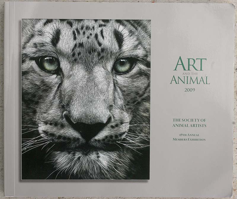
- Award of Excellence; Society of Animal Artists “Art And the Animal“; Salina, KS
- Cover Image for the 2009 SAA “Art and the Animal” collectable exhibition catalog
- Haller Distinguished Young Artist Award; Society of Animal Artists
- Commissioners Purchase Award; Greeley Stampede Invitational Western Art Show; Greeley, CO
- People’s Choice Exhibitor Award; Greeley Stampede Invitational Western Art Show; Greeley, CO
- 21 Under 31 Award Winner; Southwest Art Magazine Annual Competition; Published Sept. 2009
- Juror’s Award - Jeff Legg; Lines Into Shapes; Estes Park, CO
- Len Taylor Memorial Award; Lines Into Shapes; Estes Park, CO
- 1st Place Other Media; Art Show at the Dog Show; Wichita, Kansas
- 3rd Place Wildlife/Animal Category; The Artist Magazine Annual Competition; Published Dec. 2009
- Finalist Wildlife/Animal Category (2nd entry); The Artist Magazine Annual Competition
Furthermore I had work juried into Woodson Art Museum's "Birds in Art" on my first try and was invited to participate in the Colorado Gold Show. There was only ONE show this year (of those that give awards) that I did not win an award in. I think you could say... it has been a GOOD YEAR!
My rundown of awards for this year:
- Best In Show; Celebration Of Art; Parker, CO
- Best In Show Booth; Art In The Park; Parker, CO
- Award of Excellence; Society of Animal Artists “Art And the Animal“; Salina, KS
- Cover Image for the 2009 SAA “Art and the Animal” collectable exhibition catalog
- Haller Distinguished Young Artist Award; Society of Animal Artists
- Commissioners Purchase Award; Greeley Stampede Invitational Western Art Show; Greeley, CO
- People’s Choice Exhibitor Award; Greeley Stampede Invitational Western Art Show; Greeley, CO
- 21 Under 31 Award Winner; Southwest Art Magazine Annual Competition; Published Sept. 2009
- Juror’s Award - Jeff Legg; Lines Into Shapes; Estes Park, CO
- Len Taylor Memorial Award; Lines Into Shapes; Estes Park, CO
- 1st Place Other Media; Art Show at the Dog Show; Wichita, Kansas
- 3rd Place Wildlife/Animal Category; The Artist Magazine Annual Competition; Published Dec. 2009
- Finalist Wildlife/Animal Category (2nd entry); The Artist Magazine Annual Competition
Furthermore I had work juried into Woodson Art Museum's "Birds in Art" on my first try and was invited to participate in the Colorado Gold Show. There was only ONE show this year (of those that give awards) that I did not win an award in. I think you could say... it has been a GOOD YEAR!
More on the brothers- almost done!
I am very close to calling this piece done, but a few little things are still bothering me. I am at this time going to wait to give it the final fixative spray and put it away for a few weeks so that next time I look at it, it will be with fresh eyes. It can be helpful to put works out of sight if you have been working on it for many hours as our mind gets into a state of being so wrapped up on the little things that it can no longer see the whole picture. Sometimes after some time has passed either the solution to the problems will come to you or you will be able to look as the piece as a whole rather than parts. I made the decision to add a 2nd more prominent tree on the left to counterbalance the central one.


Sunday, November 29, 2009
Continuing On...
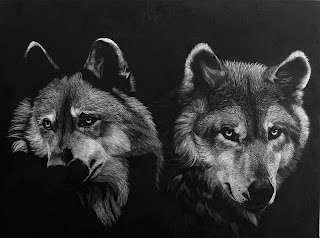
The background continues to progress, hopefully growing into something that compliments the wolves rather than detracting. Some have questioned the placement of the prominent tree being so central, and while this does go against general compositional rules when I tried moving it around in photoshop I found that when placed behind either wolf it looked like a post growing out of their heads and settled on central positioning as the most pleasant to my eye. I am still developing the background and do not consider it completed yet.
As you may notice I have continued to make minor changes to the wolves themselves as well, adjusting values and adding more fur.

As you may notice I have continued to make minor changes to the wolves themselves as well, adjusting values and adding more fur.

Saturday, November 28, 2009
Backgrounds... sigh
Like many artists, I find backgrounds a bit troublesome. In scratchbaord trying to create the impression that something is out of focus or not as sharp as your primary subject can be difficult. And if you don't make it recede from the main subject it can often compete with it, sometimes making your main subject get lost in the mix. I am attempting to put in some aspen trees behind my pair of wolves. So far they are started but still need a lot of work. They are being completed with very fine grit sandpaper.


Thursday, November 26, 2009
2010 Calendar Now Available!
Don't delay, order your 2010 scratchboard calendar today! This calendar features 12 different images of my scratchboard artwork and is printed on high quality paper. A perfect Christmas gift to give to others or to yourself! Price is only $16 (plus shipping).
Click here to go to the page to order your calendars with paypal! Quantities are VERY limited so order today!


Click here to go to the page to order your calendars with paypal! Quantities are VERY limited so order today!


HAPPY THANKSGIVING TO ALL
Wishing everyone a safe and wonderful holiday and lots of great food and good company!
The wolves themselves are pretty close to being completed, however I have decided to continue on with the dreaded background, as I think it will make for a more complete piece of work. I am hoping to get an out of focus effect with the background, not an easy thing to do with scratchboard!
A bit of glare on this photo... stay tuned for the background work.

Monday, November 23, 2009
"Art and the Animal" Opens in Colorado at The Wildlife Experience
Today I went to pick up my large elk piece called "The Challenger" from The Wildlife Experience Museum, as it was in Colorado Gold show that has ended. In the place of Colorado Gold is now Society of Animal Artist's "Art and the Animal" exhibit which will travel on to two additional museums throughout the next year. Last Saturday was the opening for that show as well as "Small Works, Big Impressions" exhibit. I was not able to attend the opening due to work (grooming) but Connie at TWE gave me a chance to look around today- both shows have some great work in them! My piece, "The Hypnotist" is the cover image for this years Art and the Animal exhibition catalog and being used for many promotional materials, which is a great honor! In addition the work sold at the initial opening for the show in Kansas and won an SAA Award of Excellence! It doesn't get much better than that!!

A bit more progress on the brothers (and even more work is done but too dark to take another photo tonight). I am starting to get antsy to start on something new.

Friday, November 20, 2009
Another hour or two...
With the approaching holidays my days have been busy, but without too much time to make progress on the brothers. I did get a couple or hours to work on the fellow on the left building up more fur... I am still debating the approach I will use for the aspen trees that will be in the background.


People always want to see close ups of how I do eyes... so as requested here is a much magnified (the actual size is about the size of a penny or smaller) image of one of the eye on the forward facing wolf. As you can see it is still all just very fine lines!

Wednesday, November 18, 2009
More on "Brotherhood"
Continuing on in my journey with the pair of wolf brothers. Still a long ways to go...

Want to know what tools I have use?
So far in this piece I have used quite a range of tools and blades...
#11 scalpel blade (very fine lines)
#11 exacto blade (fine lines)
#112 speedball scratchboard tip (medium lines)
#113 speedball scratchboard tip (heavy lines)
ultra micro fiberglass brush (soft fur effect)
Mini Macaw
I started a small 5"x7" macaw piece a few weeks ago that I scratched to black and white and then saved the coloring phase for my workshop that was held on Nov. 7. I started the color in the workshop and am close to finishing it now. I may add a bit of simple background to the piece, but have not decided for sure yet. Fortunately an art and photography friend wants to purchase the piece, so it is tentatively sold (thanks Rita!) Since this work was sold outside of a gallery, 10% of the proceeds from the sale will be given to an appropriate charitable cause. In this case the funds will be going to Colorado Parrot Rescue.
black and white before color is added - showing as about 150% actual size

.
black and white before color is added - showing as about 150% actual size

The piece after color is added (colors not quite right) - showing as full size
 (colors not quite right) - showing as full size
Tuesday, November 17, 2009
Progression of Brotherhood
I enjoyed another evening getting to make more progress on "Brotherhood" last night. The reference photos (it is a composite of several photos) for this pair of wolves was taken at Rolling HIlls Wildlife Adventure in Salina, KS. This was the location of the opening for the 49th Society of Animal Artists "Art and the Animal" show. The Rolling Hills staff was fabulous and very accomodating and I got some excellent references (despite shooting through bars in many cases). They are even going to use one of my photos for a fund raiser that they have coming up.


Monday, November 16, 2009
First Posting

Welcome to the blog for Cathy Sheeter and Aphelion Art and Photography. I will try to post to it at a minimum of weekly with both photos and my artwork, tips and tricks, and the occasional posting of my Belgian Sheepdogs.
I started a new scratchboard a few says ago of two wolves called "Brotherhood". The size is 18"x24" on ampersand scratchbord. At this time I am planning on leaving it black and white. Here is where I am at on the first wolf.
Scratchboard is my primary art medium. For those not familiar with the medium it is a form of direct engraving where a layer of black ink is scratched away to expose a white clay layer below. By scratching more or less lines, thicker and thinner lines different textures and values are achieved.
Check back soon for more updates!
Subscribe to:
Posts (Atom)