Thursday, May 19, 2011

I Am Your Leader!

I am your leader and you are under my control!! Well at least while you are viewing my art. You might scoff, but if fact whether they make a good leader or a poor one, the compositional elements of your art lead the viewer.  The way people view a piece of art is influenced by each elements of the artwork that you are viewing and really the way people see it is essentially human nature and beyond their control… but not beyond, yours, as the artist! 

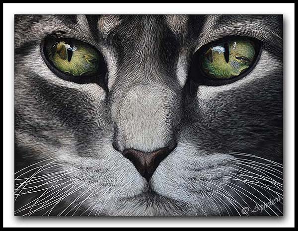
Every piece of artwork has a flow to it. It has a way that the average person sees each item within the image or how our eye travels the path of the artwork. While there will be some minor deviation based on individuality, most people’s eyes tend to mostly travel a similar path.

Through human nature certain things draw our eyes more than others. Some of the things that tend to draw our eye are:

-Strong contrast of light and dark (Bright whites, dark shadows)
- Bright colors
- Hard edges
- Lines in general, but also lines that lead in or out of an image (these lines can be anything from a branch or piece of grass, to a cloud or rock formation)
- Warm colors in a cool image
- Cool colors in a warm image

Keeping these things in mind when creating a work of art can certainly make us a better artist. Understanding compositional elements and how the eye moves helps me to make certain decisions about my works. The more complex the composition the more the artist needs to contemplate their decisions about HOW they place things in their art work - what direction it faces, how it is lit, how much contrast is on the item, etc.

Some artists are masters of leading the eye! One of my favorites is when they hide something in plain sight! Here are a couple of examples:


Copyright Bev Doolittle - "Doubled Back"

The first thing that the majority of people will notice in this piece by Bev Doolittle titled “Doubled Back” is the strong contrast and hard edges of the bear tracks lead us right up the line of snow to the rock formation that is shaped like a bear. But then the warm colors of the thicket brings us back to other aspects of the image to notice… surprise! There is a ‘real’ bear in the willows! The similar values between the bear and the thicket keep us from noticing it any sooner, just as the artist intended!


Copyright Robert Bateman - "Winter Reflection Wolf"

Robert Bateman is another one that knows just how your eye travels and uses this for impact. “Winter Reflection Wolf” plays a similar trick on our eyes. The hard lines and strong values of the water with the snow lead our eye there first. We follow it and it only leads us out of the image. But me know there is more so we come back and look harder. Next the lines of the icicles catch my eye, as do the lines leading down through the rocks. Still not all that interesting. Finally my eye catches the one rock with puffy snow pointing upwards and suddenly… bam! There’s the wolf! You wonder how you didn’t see it before, but the wolf is hidden on purpose, by using very minimal contrast and letting him merge just enough with the background that he is obscured.


Probably one of the best known Bateman images is this one:

Robert Bateman - "Midnight - Black Wolf"


Why do you think it is so popular? Not only a popular subject matter, but masterfully crafted by the artist as well!


Of course even when you are not hiding something within the image composition is paramount! How can you keep the viewers eye traveling in a manner that brings attention to the most important aspects of the work and keeps bringing them back to it?


Carl Brenders - "One to One"

Carl Brenders is not known for hiding his critters, but he still uses strong compositions to keep the viewers eye moving, but always coming back to what is most important. Many of his works have a circular flow. His well known image titled “One to One” leads our eye in a perfect circle from the wolf to the rocks, which circle back around to the wolf. Even the lighter color twig brings us back to the wolf. Simple and effective.


Daniel smith - "Sun Struck"


How do the warm colors and light lead your work in this work by Daniel Smith?


As you become more aware of what you eye is doing within a work you might want to stop and think about WHY is it traveling the way that it is. Hard lines, contrast, bright colors? Just as good composition can make an image, poor composition can ruin one just as easily. If all the elements lead out of the image rather than in toward the main subject we tend to quickly loose interest in viewing it. If the work is too busy with no center of interest that too makes us want to move on. If your strongest contrast falls on things that are not significant to the work our eye will go there, rather than to what you are trying to show us. Composition, truly can make you want to leave an image as quickly as you entered it, or it can make you want to sit and stay for a while.

So next time think about your scene and how the viewers eye will travel through your work… Like what direction your grasses are pointing (do they all point out of the frame taking your eye out too). What about branches on a tree. How does your eye flow through them? Does it bring you back around to a location you want it to or again take you out of the image? How does the light affect the travel of your eye? Is there something you can add (or take away) that will improve how smoothly your eye travels through your work? Do you have many strong lines leading out of the image? If you want something hidden is it effective?

After all you are the master and commander of all who view your work!

While I don't consider myself a master at compositions like these artists I posted, I do certainly give them a moderate amount of time and though.  How does your eye travel through this new version of "Edge of Darkness".  How does the body shape of the wolf and my choice of grasses and values in the background trees help to lead your eye in a circle?


Wednesday, May 18, 2011

"American Icon"

icon  (ˈaɪkɒn) - a person or thing regarded as a symbol of a belief, nation, community, or cultural movement

I have decided to title my little bull Bison "American Icon" as I think of them as one of the critters that people think of that "makes America, America" (maybe after the bald eagle).

This piece was colored with ampersand inks (as are all of my colored works) and size is 10"x8" and he will be headed to the Greeley Stampede Western Art show at the end of June too.  And NO I am not scratching a new board every day.  I just happened to have several close to completion at the same time.  Also once they are sprayed with fixative it evens out the tones and makes them easier to take pictures of.


"American Icon"
Scratchboard and Ink
10"x8"
© Cathy Sheeter

I also spent a couple of hours working on my harris hawk woodburning...it takes a back seat to my scratchboards when I have works due for shows, but I do hope to finish it one of these days ;)

Harris Hawk Pyrography on Birch Plywood
18"x24"


Tuesday, May 17, 2011

Bee-Mused - the color version

I am done coloring "Bee-Mused" and it will be sprayed with fixative soon.  Here is the final image and a few close ups to show the details.  Size is 24"x25.5"  It will be headed to the 2011 Greeley Stampede Invitational Western Art Show in late June.

This piece is a good follow up to my post about story telling that I posted yesterday. This scene is a composite of 6 photos, all merged to fit a vision and hopefully tell a story to the viewer.


My Website is Down

My website (http://www.aphelionart.com/) will be down until May 24th, as the people that host it for me are in the midst of moving.  I apologize for any inconvenience and the 'holes' it creates in my blog, but they should be back pretty soon.

Monday, May 16, 2011

Woman Artists Of the West Show Opens

I mentioned in an earlier blog post that I had three works selected for the Women Artists of the West annual show in Rockport, TX.  I was not able to attend the show opening, which was last weekend.  WAOW is an all women artist organization with juried membership and juried annual show.  I was delighted to have all three works selected for the show, but am even more excited that two out of the three won awards! 


Publisher's Southwest Art Magazine
Award of Excellence full‐page ad - "Yielding"

This is the second time that Southwest Art has recognised my scratchboard work (the first being in 2009 as I was selected as one of their "21 under 31" winners)


and

Honorable Mention Gamblin
Accents on the Figure System - "Rustle in the Brush"


You can view the show catalog and results at: http://www.waow.org/RockportTexas-show/SLideshow-new/index.html

Creating the Story

One of the great things about being an artist is the ability to also be a storyteller! In history many an artist was used to record facts, whether in day to day life or the natural world. We still rely often on these images to tell us what life was like during those time periods, where few written records may still exist.

While many written accounts may exist today, and likely will into the future as well, this does not stop an artist from telling a story, and in fact most people find images that tell a story to be more engaging than a standard portrait. While a camera may capture the moment in front of us, the artist can capture it in a way that exists only in their head. We can tell you a story about interaction, behavior, mood, and expressions. We posses the ability to adjust the lighting of a scene to be more dramatic, or add elements to the scene that lead your eye through an image in a certain way. We can perfect imperfections (though sometimes the imperfections add interest), remove distracting elements, or transport you to a place you may never see or go.  I am not often impressed by someone who is simply a human photo-copier.  What I like is a good storyteller!!

Plain and simple - most wildlife artists use photos for their work. We use them to tell us information about the proportions of the animals, how their muscles and body work, other details about that species, and sometimes the pose of the animal. As an artist progresses beyond trying to simply copy a photo you get to add artistic vision to the storyline. I often get asked ‘where I get my photos’ that I work from as they are so captivating. Well… the images come from a variety of places from the wild to zoos… but often the storyline I create is many photos that I use to create MY vision. I have an entire portion of photos on my computer that are background elements (trees, logs, grasses, clouds, rocks, etc. in a wide variety of light sources from side lighting to overcast light) and have no animals at all! 

While I do a lot of close up pieces, I am more and more often finding myself desiring to convey more than just a simple portrait. In piece like “The Naturalist” the wolf had an attentive expression in my primary reference photo, but it was up to me about what he was looking at. There was no obvious focus for him in my reference image. There were no flowers or butterfly. Once I decided it was to be an insect I got to choose which insect. I played with the concept of a caterpillar on its hind legs reaching toward the wolf. It would have worked and even been pretty cute, but I didn't have an image that was really what I wanted so I chose to go with a butterfly instead. However, as a nature artist you can’t go with just any old butterfly so then research comes into play. What butterflies would be found in the same native range as the wolf?? The painted lady butterfly that I included was one that I photographed here in Colorado, however it can be found throughout the entire US including areas where wolves can also be found.  even in straight portraits you can add interest by using dramatic lighting or choosing unique but strong, compositions.,

I have seen work on the web and in galleries that is painted in such a style that you would think that you are looking at a photograph.  While this can be quite impressive from a technical side (to go "Wow... can you believe that is a painting") sometimes I wonder WHY that person chose to paint that image or scene... because to me it wouldn't have been all that good of a photo, let alone a painting that they often spent between 200-400 hours working on!  Just because you CAN paint in every leaf and blade of grass, doesn't always mean that you SHOULD!  As an artist it is just as important to decide what to leave out, as it is to decide what to add.  Does the element you are putting in your work add to the story of the image or does it detract? 

Photoshop is my friend. I use it extensively to compose my layouts and see how they will work. I also use them to create composites with the multiple images I am planning on using. I adjust contrast, dodge and burn, try out a variety of trees or brush in the background, crop in various ways and so on. Much like drawing thumbnail sketches… I create Photoshop layouts to explore compositions.

The primary wolf photo in “Edge of Darkness” was actually taken at about 10 AM. There was still nice side lighting, but through my vision I was able to enhance the light source, deepen the shadows and create the edgy mood that I have in the piece. The background was created from additional photos with similar lighting. I used Photoshop to lay it out, add the trees, play with the rocks, and play with the lighting until I was pleased with the composition and the quality of light.

So while sometimes I do take and use ‘the perfect photo’ for my art, this is the exception rather than the rule.

Here are a few tiger cub photos from a recent zoo trip that are the type that alone are not perfect, but with the addition of other elements can make some captivating artwork and let me tell a more engaging story!

1. What is the cub looking at in the water. A bullfrog? A fish? Both would add visual interest and tell more of a story than the photo alone. What types of frogs/fish live in the same range as a Siberian Tiger?  I would likely remove or at least shrink the foreground rock, as it is more distracting than adding to the story.


2. This cub tested the water with his paw before going all the way in. Adding snow to the background and ice to the edge of the pool would certainly let the viewer understand his hesitant expression better and allow the cub to stand out from the rocks more. Also the addition of more water drops coming off of the raised paw could add drama.


3. While you can’t see the eyes on any of these cubs the fact that all three seem to be looking intently at something allows me to decide what it might be. The composition would be strengthened by creating more room underneath them.


4. What has captured this cubs attention? Birds, another cub, an insect? His expression and the HUGE paws are lots of fun… but I can create even more of a story with additional elements.  I would likely crop this image and put the cub far to the left and leave more room to the right (perhaps even extending it out).


All of these photos were taken on a rather overcast day and have quite flat lighting.  When I think about adding additional elements to the works I will have to keep this in mine, by either adding elements that also have fairly flat lighting, or by increasing the contrast and altering the light source to match my additional elements. 
 
So before you delete a photo because it isn't perfect... think about what you can add to the image to make it complete and to truly tell a story!

Saturday, May 7, 2011

News and Updates

Yesterday's e-mail inbox was full of news from shows. 


"The Naturalist" has been selected for the 51st Society of Animal Artists Annual exhibition "Art and the Animal" which will run September 17 - December 31, 2011 at the Dennos Museum Center in Traverse City, MI. The piece may then be selected to go on national tour to additional museums for up to a year.


"Going for Gold" was not selected for Birds In Art.  There were MANY outstanding works that did not make the cut this year and I swear you could make a top notch show with the rejected works from this show!!  And I say that in absolute, total honesty.  This show is a tough egg to crack (ok bad pun...I know!!).  I know top notch artist that have applied over 10 times without ever getting in and others seem to get in every year.  I got in on my first try in 2009, but was rejected last year and this one.  Oh well... its the name of the game in the art world.  It is just their opinion, on that day, with that set of work.  Its not wrong, its not right... it just is!  LOL...  I knew that this piece would not be their traditional bird art... so it could play out either way.  My congratulations to those that did get in this year.


I have pretty much finished "Edge of Darkness" though am still making some minor edits to the work before I spray it with its protective fixative.    Size is 20"x16" and it will be left black and white.


The bison portrait is finished as a black and white, but I am pondering coloring it.  Hmmm....
Any unevenness that you see in the black parts of this photo (or Edge) is a result of the work not being sprayed with fixative.  Different tools can make the board shiny or reflective where they are used than other areas that are more of a matte black (the board starts out a matte black).  These shiny parts usually look 'more black' and or like odd glare when photographed.  Once the works are sprayed with varnish it all evens out and is a nice even shade of black. 


And Bee-Mused is in the process of being colored.  It is far from done, so it would be a WIP photo of the coloring.  I still have to color all grasses (short and tall) as well as the bee and the background.  I will continue to work the wolves a bit more too.

Monday, May 2, 2011

What is on the Scratching Table??

Things have been very busy for me of late.  A 10-day trip to Oregon at the End of March, 10-days home (of which I worked 60 hours in those ten days grooming) and then off for another 10-day trip to California in early April, where I was photographer for a large dog show... Once I was home I had to get over 5,000 photos online...  then the Governor's Show and my art fair (getting prints ready plus cards, bookmarks and magnets) I feel I have had little time to actually create artwork in the past month!  But I have been stealing little snippets of time to work on stuff.  These are the two boards I have on the go right now.


American Bison are, of course, one of the great icons of the American West and popular subjects for art, yet I had never done one in scratchboard... well until now!  I made a point of taking many bison photos in Yellowstone last year when I visited with the intent of creating some works from them.  This big bull had a rather amicable expression on his face when he looked at me and nice side lighting, which can be quite dramatic for scratchboard.  This board is 10"x8" in size.

Creating Bison fur has its own set of challenges, as it grows thick, curly and in an unpredictable pattern, and with a variety of density and textures.  Trying to create the depth and thickness of fur and the right textures requires lots of layers. It still has a ways to go to perfect the texture and get just enough details on the left side of the board but to leave some mystery for the viewer as well.  No title for this guy yet.


I am also working on a new wolf piece (20"x14") which I am for now calling "Edge Of Darkness".  I liked the dramatic lighting and non-typical pose of this wolf.   His leering expression and the dynamic lighting I felt added a nice touch of tension to this piece.  I have actually made more progress since this photo was taken, but it gives you an idea of where I am going.  This piece will have foreground and possibly some background.


Now I am off to the UPS to mail my three works that were accepted into the Women Artists Of the West annual show, which this year will be in Rockport, TX.  It is my first year as a member of this association and I was delighted that they accepted all three of my works into the show.  The three works are: "Yielding""Rustle In The Brush", and "Charisma".  I will not be able to attend the show opening, as I simply have too much going on, but it promises to be a wonderful show full of high quality art.  If you are near the area the show will be on display from May 11 to June 4 at the Rockport Center for the Arts.  The opening reception is Saturday, May 14 from 5-7 PM and open to the public.